In order to move forward with the project and stay true to the Dishonored style and bring something new to it I needed to dissect what is pertinent to the IP visually.
Gathering Reference
I gathered a lot of reference by taking high resolution screenshots in-game in Dishonored 2, Death of the Outsider, and to some extent Dishonored 1 (not included here as it strays too far from my vision).
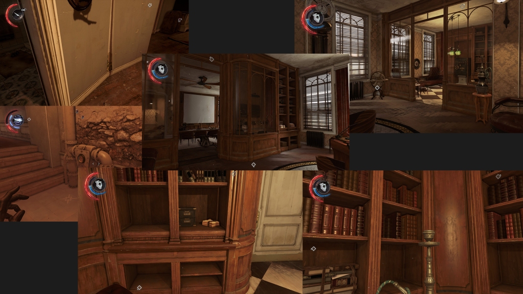
The interiors I found were interesting and mostly provided a warm feeling due to their mostly warm and monochromatic colour palettes with cool lighting coming in from exteriors to provide easy to spot exit points in the level design. I also quite like the transitions inside the interiors themselves with darker areas often providing alternative paths. The style of the furniture and larger interior elements seem to draw inspiration a lot from Victorian & Edwardian interior design.
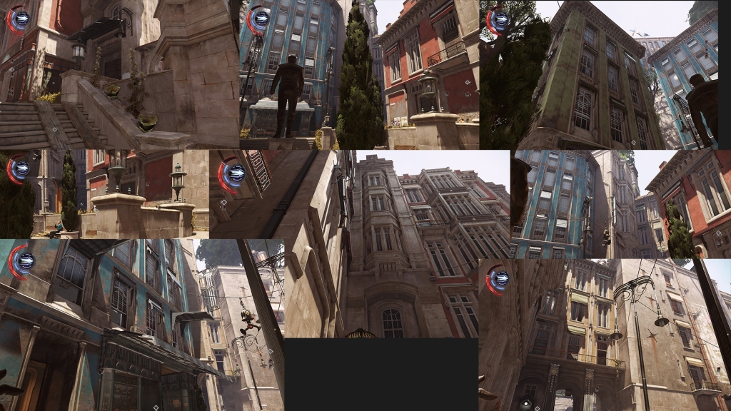

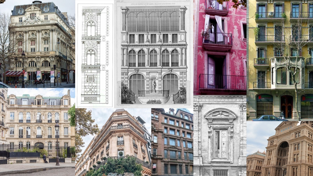
With the interior already heavily prototyped I took a lot more time recently in gathering existing reference for the exterior areas and lighting in the areas which I’m taking most inspiration from. There’s a lot of quite cool neutral lighting coming in to help contrast with the warm materials (a lot of stone and varying colours of walls). The architecture in these exteriors seem to draw more inspiration from Italian, French & Spanish Renaissance architecture with very tall over-looming buildings, a lot of pillars, windows being pushed into the walls themselves, and the varying uses of primary colours for walls to help contrast with the nice warm stone bricks that are used quite heavily.
For my environment I will be trying to achieve this nice neutral lighting with a slight touch of warmth as seen in these areas, and then have contrasting exterior transitions which could be achieved with post process volumes or just simply through the materials.
Colour Palettes
I further broke down these screenshots of key areas and moments in the game into their basic colour palettes where I noticed a lot of monochromatic schemes in many areas with the often pop of primary colours like reds, yellows, greens, blues etc – this is what I think keeps the environments from becoming stale and what help pull Dishonored 2 and Death of the Outsider (set in the same area) apart from the first Dishonored game which was much more drab and monochromatic with more useage of blues.
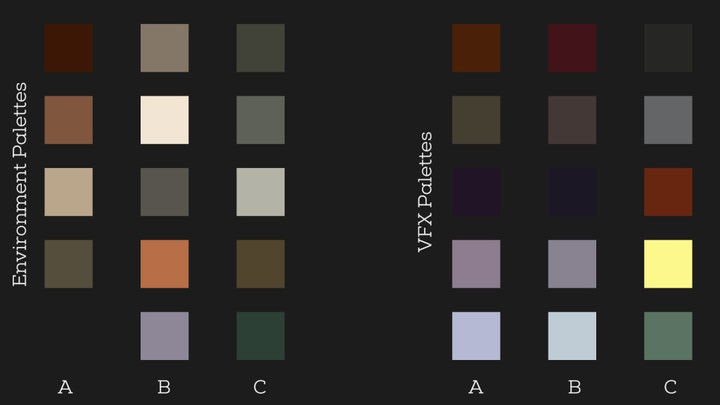
As VFX is the focus I also did a lot of research into key moments and iconography of the game and broke those down into VFX colour palettes which again used a lot of monochromatic purples/greys to represent the mysterious void which is where all the powers are pulled from, with a mixture of again pops of bright primary colours such as blues, reds etc to help give them a sense of impact.
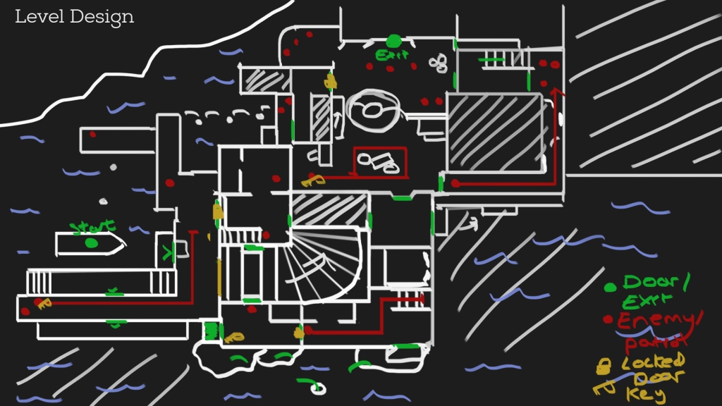
Level Design
To help give me a basis of the environment and gameplay beats I’ve laid out a basic level plan to help me see the paths the player will be able to take, where enemies are etc. A lot of this is subject to change but it gives me a good starting point and an even better idea of the types of assets I will require.
Organisation
To best handle the environment art of the level I have broken up screenshot-by-screenshot what I need and what could be re-used where (based on what I need to make from this point so this excludes anything already made).
A lot of assets I have decided to use trims and material instances the most I can where there are only a few exceptions to that rule which are props or decals, all modular pieces however will use trims and tiling materials with material instancing to add the variation I require (i.e. a painted wall may be changed from blue to red without the need to spend anymore texture budget).
I’ve also used vertex counts to help me profile the game’s performance early – though these are only estimates and will likely change as there is always some balancing required such as introducing extra geometry in return for less texture fetches etc.

VFX Reference Concepts
I managed to track down the concept artists who worked on the Dishonored franchise and found a lot of the concept art used as reference points for their VFX and unused ideas – a lot of it is very expressive and in a consistent style which I would like to follow. The use of pops of colour are more prominent in these concepts also as they follow a graphical novel style with very over the top impacts, lots of sharp edges, smoke tendrals, and specific blood splatter patterns which are all integral to the weighty impact of Dishonored’s main selling point and this project’s focus – the ability system.
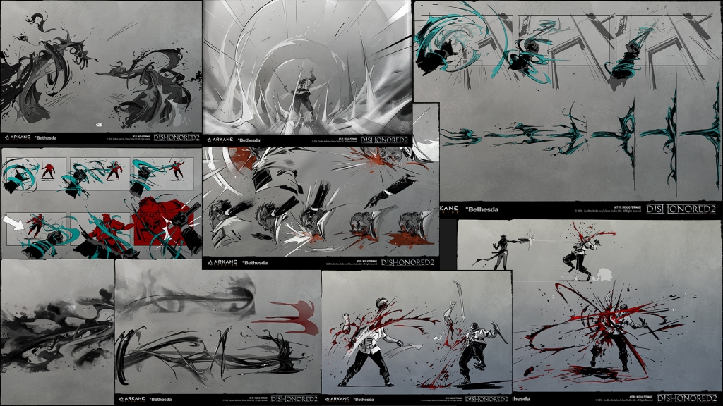
I will be utilising these concepts as a starting point and combining elements of them with some of my own ideas to help bring something new to the powers, and on-top of that I have been studying the final VFX in the games to see how close they are to the concept and breakdown how they got close to these concepts.
